Pine Script v6 Visuals: Polylines, Linestyles, Text
How to create custom chart visuals in Pine Script v6 using polylines, dashed plot lines, text formatting, and advanced fills.

Marketing
Reviewed by Mike Christensen
Fact-checked by Mike Christensen

Bottom Line
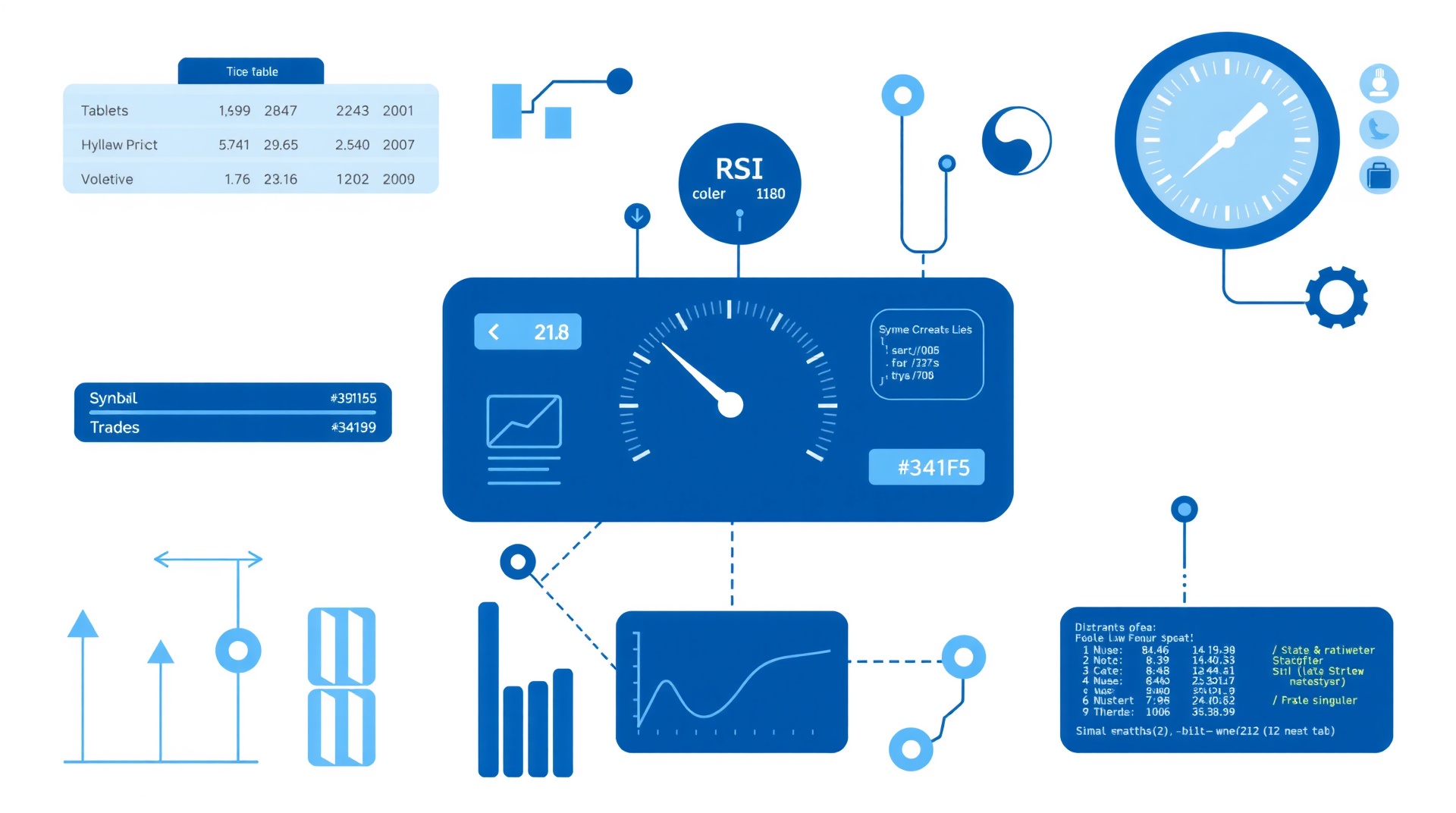
- Pine Script v6 adds polylines for multi-point shapes dashed and dotted plot lines and bold/italic text formatting
- Combine polylines with fills to create custom bands channels and highlighted zones on charts
- Use plot linestyles to visually distinguish between main indicators signal lines and reference levels
- Text formatting with text.format_bold and text.format_italic improves readability of labels boxes and tables
Pine Script v6 introduces three categories of visual improvements that let you build more polished and readable chart tools1. Polylines create multi-point shapes and custom zones. The new linestyle parameter for plot() adds dashed and dotted lines without extra drawing objects. And text formatting constants let you apply bold and italic emphasis to labels, boxes, and table cells.
This guide walks through each feature with practical code examples, then combines them into a complete trading dashboard that demonstrates professional-quality chart visuals.
Polyline Shapes
Polylines are the most significant visual addition in v6. A polyline connects an array of chart.point objects with line segments, creating multi-point shapes that were previously impossible without managing dozens of individual line objects2. You can draw closed shapes, filled regions, and curved paths with a single polyline.new() call3.
How Polylines Work
Every polyline starts with an array of chart.point objects. Each point defines an x-coordinate (bar index or timestamp) and a y-coordinate (price)3. The polyline.new() function connects these points in sequence and optionally closes the shape by connecting the last point back to the first.
Key parameters for polyline.new() include3:
- points: an array of chart.point objects defining the vertices
- curved: when true, connects points with smooth curves instead of straight segments
- closed: when true, draws a segment from the last point back to the first
- fill_color: fills the interior of the polyline with a color
- line_style: accepts line.style_solid, line.style_dashed, or line.style_dotted
Drawing a Custom Channel
One of the most practical uses for polylines is drawing custom price channels. Instead of two separate line objects for the upper and lower bands, a single closed polyline can draw the entire channel with a filled background.
//@version=6
indicator("Polyline Channel", overlay = true, max_polylines_count = 50)

int lookback = input.int(20, "Channel Lookback", minval = 5)

float upperBand = ta.highest(high, lookback)
float lowerBand = ta.lowest(low, lookback)

if bar_index % lookback == 0 and bar_index > lookback * 2
    var points = array.new()
    points.clear()

    for i = lookback to 0
        points.push(chart.point.from_index(bar_index - i, ta.highest(high, lookback)[i]))

    for i = 0 to lookback
        points.push(chart.point.from_index(bar_index - i, ta.lowest(low, lookback)[i]))

    polyline.new(points, closed = true,
         line_color = color.new(color.blue, 50),
         fill_color = color.new(color.blue, 90),
         line_width = 1)
This indicator draws a filled channel every 20 bars, connecting the highest highs along the top and the lowest lows along the bottom. The closed = true parameter connects the shape into a filled polygon. Compared to using two separate plot lines with fill(), the polyline approach gives you a shape that precisely follows the historical channel boundaries.
Building Highlighted Zones
Polylines are useful for marking specific price zones on the chart. For example, you can highlight the opening range of each trading session as a filled rectangle.
//@version=6
indicator("Opening Range Zone", overlay = true, max_polylines_count = 50)

int rangeBars = input.int(5, "Opening Range Bars", minval = 1)

var float rangeHigh = na
var float rangeLow = na
var int rangeStart = na
var bool rangeSet = false

if session.isfirstbar
    rangeHigh := high
    rangeLow := low
    rangeStart := bar_index
    rangeSet := false

if not rangeSet and bar_index > 0
    rangeHigh := math.max(rangeHigh, high)
    rangeLow := math.min(rangeLow, low)

if bar_index - rangeStart == rangeBars and not rangeSet
    rangeSet := true
    var points = array.new()
    points.clear()
    points.push(chart.point.from_index(rangeStart, rangeHigh))
    points.push(chart.point.from_index(bar_index, rangeHigh))
    points.push(chart.point.from_index(bar_index, rangeLow))
    points.push(chart.point.from_index(rangeStart, rangeLow))
    polyline.new(points, closed = true,
         line_color = color.new(color.orange, 30),
         fill_color = color.new(color.orange, 85),
         line_width = 2)
The indicator captures the high and low of the first five bars of each session, then draws a filled rectangle marking that opening range. Traders use opening range breakouts as entry signals, and this visual makes the range immediately visible on the chart.
Plot Linestyles
Pine Script v6 adds a linestyle parameter to the plot() function1. This lets you render plotted lines as dashed or dotted without creating separate drawing objects. The three available constants are3:
- plot.linestyle_solid: the default solid line (same as v5 behavior)
- plot.linestyle_dashed: a dashed line pattern
- plot.linestyle_dotted: a dotted line pattern
The linestyle parameter only takes effect when the plot style displays a line. This includes plot.style_line, plot.style_linebr, plot.style_stepline, plot.style_stepline_diamond, and plot.style_area3.
Distinguishing Indicator Components
The most practical use of plot linestyles is visual differentiation between indicator components. In a moving average ribbon, you can use solid lines for the primary averages and dashed or dotted lines for secondary references.
//@version=6
indicator("Styled Moving Averages", overlay = true)

float sma20 = ta.sma(close, 20)
float sma50 = ta.sma(close, 50)
float sma200 = ta.sma(close, 200)

plot(sma20, "SMA 20", color.blue, 2, linestyle = plot.linestyle_solid)
plot(sma50, "SMA 50", color.orange, 2, linestyle = plot.linestyle_dashed)
plot(sma200, "SMA 200", color.red, 1, linestyle = plot.linestyle_dotted)
The primary 20-period SMA appears as a solid line. The 50-period SMA is dashed to show it is a secondary reference. The 200-period SMA is dotted to indicate it is a long-term backdrop. This visual hierarchy helps traders immediately understand the relative importance of each line.
Signal Lines and Reference Levels
Oscillator indicators often have a main line and a signal line. In v5, both were solid lines differentiated only by color. In v6, you can use linestyle to add a second dimension of visual distinction2.
//@version=6
indicator("MACD with Linestyles")

[macdLine, signalLine, histLine] = ta.macd(close, 12, 26, 9)

plot(macdLine, "MACD", color.blue, 2, linestyle = plot.linestyle_solid)
plot(signalLine, "Signal", color.orange, 2, linestyle = plot.linestyle_dashed)
plot(histLine, "Histogram", color.gray, 1, plot.style_columns)
hline(0, "Zero", color.new(color.gray, 50), hline.style_dotted)
The MACD line is solid, the signal line is dashed, and the zero line is dotted. Each component has a distinct visual identity that works even in grayscale or for color-blind users.
Bollinger Bands with Linestyles
Bollinger Bands benefit from linestyle differentiation. The middle band (moving average) is the primary reference, while the upper and lower bands are secondary boundaries.
//@version=6
indicator("Styled Bollinger Bands", overlay = true)

int length = input.int(20, "Length")
float mult = input.float(2.0, "Multiplier")

float basis = ta.sma(close, length)
float dev = mult * ta.stdev(close, length)
float upper = basis + dev
float lower = basis - dev

p1 = plot(upper, "Upper Band", color.new(color.blue, 30), 1, linestyle = plot.linestyle_dashed)
p2 = plot(basis, "Basis", color.blue, 2, linestyle = plot.linestyle_solid)
p3 = plot(lower, "Lower Band", color.new(color.blue, 30), 1, linestyle = plot.linestyle_dashed)

fill(p1, p2, color = color.new(color.blue, 95))
fill(p2, p3, color = color.new(color.blue, 95))
The solid middle band draws the eye as the primary reference. The dashed upper and lower bands recede visually, clearly communicating that they are volatility boundaries rather than trend signals.
Text Formatting
Pine Script v6 adds text_formatting parameters to label.new(), box.new(), and table.cell()1. Two formatting constants are available3:
- text.format_bold: renders text in bold typeface
- text.format_italic: renders text in italic typeface
You can combine both formats using the addition operator: text.format_bold + text.format_italic creates bold italic text3.
Bold Labels for Key Levels
Labels at important price levels benefit from bold text to stand out from regular annotations.
//@version=6
indicator("Formatted Labels", overlay = true)

float pivotHigh = ta.pivothigh(5, 5)
float pivotLow = ta.pivotlow(5, 5)

if not na(pivotHigh)
    label.new(bar_index - 5, pivotHigh,
         str.tostring(pivotHigh, format.mintick),
         style = label.style_label_down,
         color = color.green,
         textcolor = color.white,
         size = size.small,
         text_formatting = text.format_bold)

if not na(pivotLow)
    label.new(bar_index - 5, pivotLow,
         str.tostring(pivotLow, format.mintick),
         style = label.style_label_up,
         color = color.red,
         textcolor = color.white,
         size = size.small,
         text_formatting = text.format_bold)
Pivot high and low labels appear in bold, making them immediately visible among other chart annotations. The bold text communicates that these are significant structural levels rather than routine information.
Italic Notes for Context
Use italic formatting for supplementary information that should be visible but not dominant.
//@version=6
indicator("Session Notes", overlay = true)

if session.isfirstbar
    label.new(bar_index, low,
         "Session Open",
         style = label.style_label_up,
         color = color.new(color.gray, 50),
         textcolor = color.white,
         size = size.tiny,
         text_formatting = text.format_italic)
The italic "Session Open" labels are readable but visually subordinate to bold pivot labels or other primary annotations. This creates a natural visual hierarchy on the chart.
Formatted Table Headers
Tables with bold headers and regular body text are easier to read. The text_formatting parameter in table.cell() lets you style individual cells.
//@version=6
indicator("Formatted Table", overlay = true)

var table stats = table.new(position.top_right, 2, 4,
     bgcolor = color.new(color.gray, 85), frame_width = 1, frame_color = color.gray)

if barstate.islastconfirmedhistory
    table.cell(stats, 0, 0, "Metric", text_color = color.white,
         text_formatting = text.format_bold)
    table.cell(stats, 1, 0, "Value", text_color = color.white,
         text_formatting = text.format_bold)

    table.cell(stats, 0, 1, "Close", text_color = color.white)
    table.cell(stats, 1, 1, str.tostring(close, format.mintick), text_color = color.white)

    table.cell(stats, 0, 2, "Volume", text_color = color.white)
    table.cell(stats, 1, 2, str.tostring(volume, "#,###"), text_color = color.white)

    float changePercent = (close - close[1]) / close[1] * 100
    table.cell(stats, 0, 3, "Change", text_color = color.white)
    table.cell(stats, 1, 3, str.tostring(changePercent, "#.##") + "%",
         text_color = changePercent >= 0 ? color.green : color.red,
         text_formatting = text.format_bold)
The header row and the change percentage cell use bold formatting. The header formatting establishes the column structure, while the bold change value draws attention to the most important metric in the table.
Combining Visual Features
The real power of v6 visual features emerges when you combine polylines, linestyles, and text formatting into a single indicator. Here is a complete trading dashboard that uses all three feature categories to create a polished, professional chart tool.
//@version=6
indicator("v6 Visual Dashboard", overlay = true, max_polylines_count = 50)

// Inputs
int emaFast = input.int(9, "Fast EMA")
int emaSlow = input.int(21, "Slow EMA")
int bbLength = input.int(20, "BB Length")
float bbMult = input.float(2.0, "BB Multiplier")

// Calculations
float fastEMA = ta.ema(close, emaFast)
float slowEMA = ta.ema(close, emaSlow)
float bbBasis = ta.sma(close, bbLength)
float bbDev = bbMult * ta.stdev(close, bbLength)
float bbUpper = bbBasis + bbDev
float bbLower = bbBasis - bbDev
bool bullish = fastEMA > slowEMA

// Plot EMAs with linestyles
plot(fastEMA, "Fast EMA", color.green, 2, linestyle = plot.linestyle_solid)
plot(slowEMA, "Slow EMA", color.red, 2, linestyle = plot.linestyle_dashed)

// Plot Bollinger Bands with dotted outer bands
p1 = plot(bbUpper, "BB Upper", color.new(color.purple, 40), 1, linestyle = plot.linestyle_dotted)
p2 = plot(bbLower, "BB Lower", color.new(color.purple, 40), 1, linestyle = plot.linestyle_dotted)
fill(p1, p2, color = color.new(color.purple, 95))

// Draw trend zone polyline every 20 bars
if bar_index % 20 == 0 and bar_index > 40
    var zonePoints = array.new()
    zonePoints.clear()
    for i = 20 to 0
        zonePoints.push(chart.point.from_index(bar_index - i, math.max(fastEMA[i], slowEMA[i])))
    for i = 0 to 20
        zonePoints.push(chart.point.from_index(bar_index - i, math.min(fastEMA[i], slowEMA[i])))
    polyline.new(zonePoints, closed = true,
         line_color = color.new(bullish ? color.green : color.red, 70),
         fill_color = color.new(bullish ? color.green : color.red, 90),
         line_width = 1)

// EMA crossover labels with bold formatting
if ta.crossover(fastEMA, slowEMA)
    label.new(bar_index, low,
         "BUY",
         style = label.style_label_up,
         color = color.green,
         textcolor = color.white,
         size = size.small,
         text_formatting = text.format_bold)

if ta.crossunder(fastEMA, slowEMA)
    label.new(bar_index, high,
         "SELL",
         style = label.style_label_down,
         color = color.red,
         textcolor = color.white,
         size = size.small,
         text_formatting = text.format_bold)

// Status table with formatted headers
var table statusTable = table.new(position.top_right, 2, 3,
     bgcolor = color.new(color.gray, 80), frame_width = 1, frame_color = color.gray)

if barstate.islast
    table.cell(statusTable, 0, 0, "Indicator", text_color = color.white,
         text_formatting = text.format_bold)
    table.cell(statusTable, 1, 0, "Status", text_color = color.white,
         text_formatting = text.format_bold)

    table.cell(statusTable, 0, 1, "Trend", text_color = color.white)
    table.cell(statusTable, 1, 1, bullish ? "BULLISH" : "BEARISH",
         text_color = bullish ? color.green : color.red,
         text_formatting = text.format_bold)

    string bbPos = close > bbUpper ? "Above BB" : close < bbLower ? "Below BB" : "Inside BB"
    table.cell(statusTable, 0, 2, "BB Position", text_color = color.white,
         text_formatting = text.format_italic)
    table.cell(statusTable, 1, 2, bbPos, text_color = color.white)
This dashboard demonstrates all three v6 visual features working together. The solid fast EMA and dashed slow EMA create visual hierarchy through linestyles. The dotted Bollinger Band boundaries recede behind the primary trend lines. Polyline shapes fill the zone between the two EMAs with trend-colored shading. Bold labels mark crossover signals. And the status table uses bold headers and italic secondary labels to organize information clearly.
Performance Considerations
Visual features consume resources on the chart. Keep these limits and best practices in mind when building complex visual indicators.
Polyline Limits
Each script can display up to 100 polylines by default. You can increase this to a maximum of 100 using the max_polylines_count parameter in indicator()3. Older polylines are automatically deleted when the limit is reached. Design your indicators to create polylines at appropriate intervals rather than on every bar.
Point Array Size
Each polyline can connect up to 10,000 chart.point objects3. For most indicators, you will use far fewer points. If you are drawing shapes with many vertices, keep the point count as low as practical to maintain chart performance.
Linestyle Compatibility
The linestyle parameter only works with line-based plot styles. If you use plot.style_histogram, plot.style_columns, plot.style_circles, or plot.style_cross, the linestyle parameter is ignored3. Always pair linestyle with plot.style_line, plot.style_linebr, plot.style_stepline, plot.style_stepline_diamond, or plot.style_area.
Text Formatting Scope
The text_formatting parameter applies to the entire text content of a label, box, or table cell3. You cannot mix bold and regular text within a single cell or label. If you need mixed formatting, use separate drawing objects positioned adjacent to each other.
Migrating v5 Visual Scripts
If you have existing v5 indicators that use multiple line objects to approximate polyline shapes, v6 gives you the opportunity to simplify your code2. A common v5 pattern creates arrays of line objects and manages their lifecycle manually. In v6, you can replace those line arrays with a single polyline.
For plot linestyles, v5 scripts that used hline() with hline.style_dashed as a workaround for dashed horizontal lines can now use plot() directly with linestyle = plot.linestyle_dashed2. This gives you a dynamic dashed line that follows your data rather than a static horizontal reference.
Text formatting is purely additive. No v5 code needs to change2. You simply add the text_formatting parameter to existing label.new(), box.new(), or table.cell() calls where you want bold or italic emphasis.
Automate Your Visual Strategies
Visual indicators built with v6 features can feed directly into automated trading systems through TradersPost5. While the visual elements themselves display only on TradingView charts, the underlying calculations that drive those visuals can generate alerts and webhook signals for automated execution4.
For example, the dashboard indicator above calculates EMA crossovers and Bollinger Band breakouts. You can add alert conditions based on these calculations and connect them to TradersPost webhooks5. The bold "BUY" and "SELL" labels on the chart correspond to the same signals that trigger automated trades through your connected broker.
This workflow gives you the best of both worlds: professional-quality chart visuals for manual monitoring and analysis, plus fully automated execution for the strategies you trust to run on their own.
References
1 Pine Script Release Notes
2 Pine Script v5 to v6 Migration Guide
3 Pine Script v6 Language Reference
4 Pine Script User Manual
5 TradersPost - Automated Trading Platform